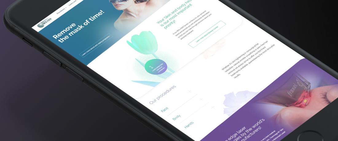
We were recently contacted by ‘Biolaser’, a medical centre in Luxembourg that offers a wide range of aesthetic medical services using brand-new laser technologies from leading manufacturers. Its high quality service and niche offering account for the popularity of this centre among its customers.
The challenging question they face, is how can a leading cosmetology centre become visible to a wider audience? Traditional word of mouth from those who have already used its services is one way, however the quantity of such feedback is minuscule compared with the possibilities that the internet offers. For this reason, a modern website with a clear interface and well-thought through web design is surely the best way for any organisation to self-promote.
How did the old website look?
‘Biolaser’ had their Internet page created a few years ago. It contained a list of services provided, and some contact information. But its style could not be defined as modern, and neither was its appearance attractive. Since the website was developed several years ago, the design had become outdated when The Loupe were approached. Furthermore, technical requirements for search engines to locate the most relevant websites had changed greatly during those years. As a result, the website of ‘Biolaser’ failed to meet such new requirements, and its search ranking suffered. The consequence: the website's limitations were off-putting for potential clients.
The outdated website was not the only issue. For instance, there was no mobile version of the website either. It’s no secret that search engines like Google do not provide good ranking results for websites without a mobile-friendly version, and that's easily explained.
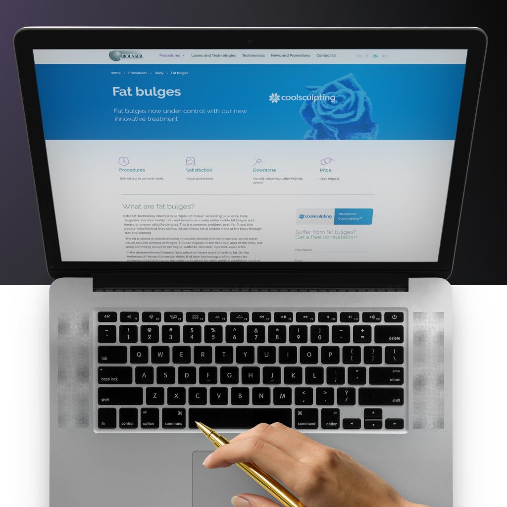 Multilingual aspects of the website, style and functionality
The Loupe team’s mission was thus to create a new website for the company, which would not only inform people about the services provided by the clinic but also attract and retain customers.
The main goal was the development of a website that would motivate the users to perform a set ‘target action’. In other words, encourage users to arrange a first appointment free of charge.
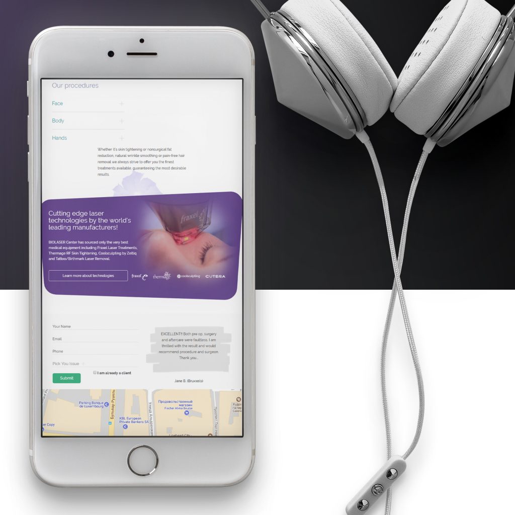
The second goal was to make it possible to use the website via mobile devices. It is a strategic need to have a mobile version of any website in the era of tablet computers and mobile phones, that are in the hands of users almost round-the-clock. Convenient page layouts and the ability to arrange appointments online via a handheld smartphone is now a must.
This functionality significantly increases the likelihood that someone landing on the site will navigate to the appointments form and decide to take up the initial offer, and then use it again to book subsequent appointments at a later stage.
Last, but by no means least, The Loupe needed to provide different language versions that would logically make it popular to a wider audience.
What have web designers and web developers do?
The Loupe professionals have made the website not only clear and convenient for the users, but also made it aesthetically attractive. Possible routes of the customers through the website were thought out to the last detail. Some tools to keep page visitors engaged with the site were realised with the help of effective web design.
Now, people looking online for information about modern aesthetic medicine services can get detailed information about the ‘Biolaser’ clinic and its services, make contact with its staff immediately via the website, and keep in touch in the future.
 Moreover, The Loupe team has reshaped the website of ‘Biolaser’ completely – both the desktop and the mobile versions. From the pleasant colour scheme of the home page, to the convenient menu, the web-design specialists made the page content more relevant and better oriented towards the target audience.
Overall, the new website inherited the previous structure, but it now demonstrates this in a more comfortable and accessible form. The menu category and catalogues were redefined and regrouped, influencing the general style of the developed website too.
Finally, and possibly of greatest importance to Biolaser’s French, Italian, and Russian speaking clients, the website is now available in those languages too.
 Much has been done from the point of view of the multilingual concept. The whole content is now shown in other popular languages as well: French, Italian, English and Russian, helping to orientate the page to a wider audience from European countries.
Another significant novelty is a feedback section, where every customer can share their opinions concerning the work of the clinic, and potential patients can read reviews by those who have already used the services rendered by 'Biolaser'.
What impact does good web design have on business?
According to the staff of 'Biolaser', the centre now regularly has new clients contacting them via the website. Without any extra effort, the centre now makes additional profit as a direct result of well thought through web design and improved usability.
Contact the Loupe team to get the best from your online presence!
A growing number of people prefer the convenience of accessing the Internet via their mobile devices on-the-go, and Google tends to 'filter out' desktop-only sites to avoid a negative user experience. We all know that it can be a challenge to read and navigate a conventional website on a mobile device.The old ‘Biolaser’ website had other shortcomings too. Some sections were limited to just a title, without showing any content. This reduced the informational value and general attractiveness of the whole website. A further serious drawback of the old version was that texts were only presented in English. Though there were some buttons to change the language, the previous contractor seemed to have no experience in working with multi-language websites and failed to cope with the abundance of texts in different languages. This decreased the chances of ‘Biolaser’ attracting customers who used search engines in languages other than English.
 Multilingual aspects of the website, style and functionality
The Loupe team’s mission was thus to create a new website for the company, which would not only inform people about the services provided by the clinic but also attract and retain customers.
The main goal was the development of a website that would motivate the users to perform a set ‘target action’. In other words, encourage users to arrange a first appointment free of charge.
The second goal was to make it possible to use the website via mobile devices. It is a strategic need to have a mobile version of any website in the era of tablet computers and mobile phones, that are in the hands of users almost round-the-clock. Convenient page layouts and the ability to arrange appointments online via a handheld smartphone is now a must.
This functionality significantly increases the likelihood that someone landing on the site will navigate to the appointments form and decide to take up the initial offer, and then use it again to book subsequent appointments at a later stage.
Last, but by no means least, The Loupe needed to provide different language versions that would logically make it popular to a wider audience.
What have web designers and web developers do?
The Loupe professionals have made the website not only clear and convenient for the users, but also made it aesthetically attractive. Possible routes of the customers through the website were thought out to the last detail. Some tools to keep page visitors engaged with the site were realised with the help of effective web design.
Now, people looking online for information about modern aesthetic medicine services can get detailed information about the ‘Biolaser’ clinic and its services, make contact with its staff immediately via the website, and keep in touch in the future.
 Moreover, The Loupe team has reshaped the website of ‘Biolaser’ completely – both the desktop and the mobile versions. From the pleasant colour scheme of the home page, to the convenient menu, the web-design specialists made the page content more relevant and better oriented towards the target audience.
Overall, the new website inherited the previous structure, but it now demonstrates this in a more comfortable and accessible form. The menu category and catalogues were redefined and regrouped, influencing the general style of the developed website too.
Finally, and possibly of greatest importance to Biolaser’s French, Italian, and Russian speaking clients, the website is now available in those languages too.
 Much has been done from the point of view of the multilingual concept. The whole content is now shown in other popular languages as well: French, Italian, English and Russian, helping to orientate the page to a wider audience from European countries.
Another significant novelty is a feedback section, where every customer can share their opinions concerning the work of the clinic, and potential patients can read reviews by those who have already used the services rendered by 'Biolaser'.
What impact does good web design have on business?
According to the staff of 'Biolaser', the centre now regularly has new clients contacting them via the website. Without any extra effort, the centre now makes additional profit as a direct result of well thought through web design and improved usability.
Contact the Loupe team to get the best from your online presence!