UI/UX design, development of a website for a clinique
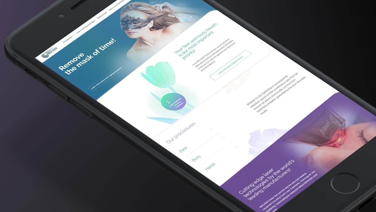
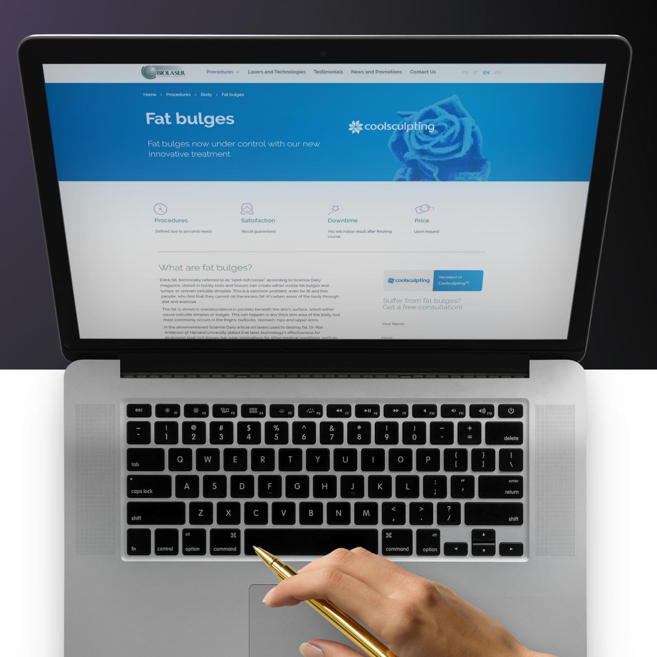
Great UI/UX design: better colors, clearer menus, smoother contact options, a lot of attention paid to usability. Multilingual function for multicultural target audience of Luxembourg: 4 languages to chose. Both desktop and mobile versions – now the clinic’s website is as innovative, as their technologies. Aesthetic renovation for the center of aesthetic medicine.

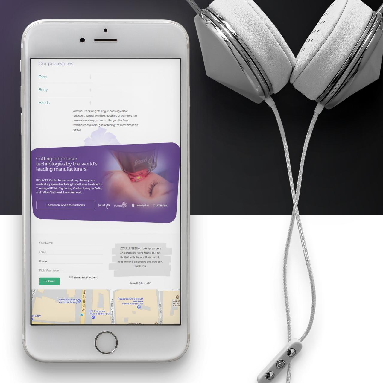
UI/UX design, mobile version for a clinique
The old website failed to target the audience of smartphone and tablet users. We have changed that by making the interface mobile-friendly. As a result, the traffic increased, and Biolaser got more clients.

Usability, which is thought through. UI/UX design for a website.
The users can choose procedures and schedule doctor visits online. This option not only meets the regulars’ needs but also attracts new clients encouraging them to schedule the first appointment for free directly on the website.

Website design for a better lead generation
Another novation is a comments section on the website. Each client can describe his or her Biolaser experience so that potential customers would read it. The live feedback on the website is the best advertisement.
Read more about this case in our blog post "How good web design helps increase profit".