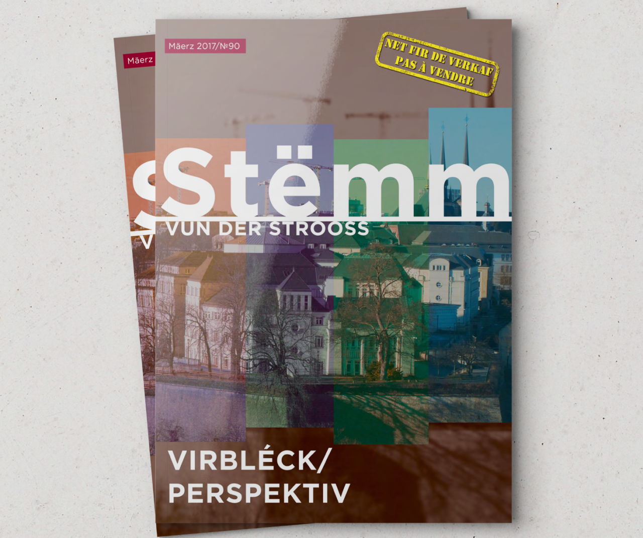
Strong cover design
Deep colors put under dim light come into notice, while Luxembourgian scenery depicted in the background appeals to local audience encouraging people to buy the journal.
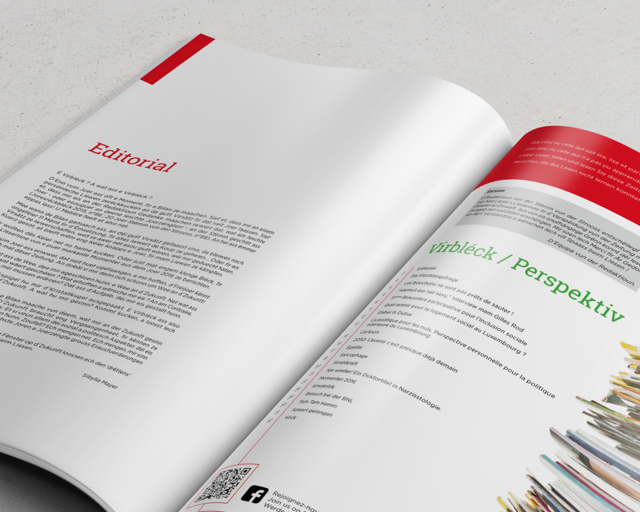
Smart spacing
Airy lines and wide margins make the text legible and easier to comprehend. All the standing heads are marked with futuristic dyes (e.g., violet, candy apple red, metallic), which match the issue’s topic – the prospects of humankind.
Tracing the line
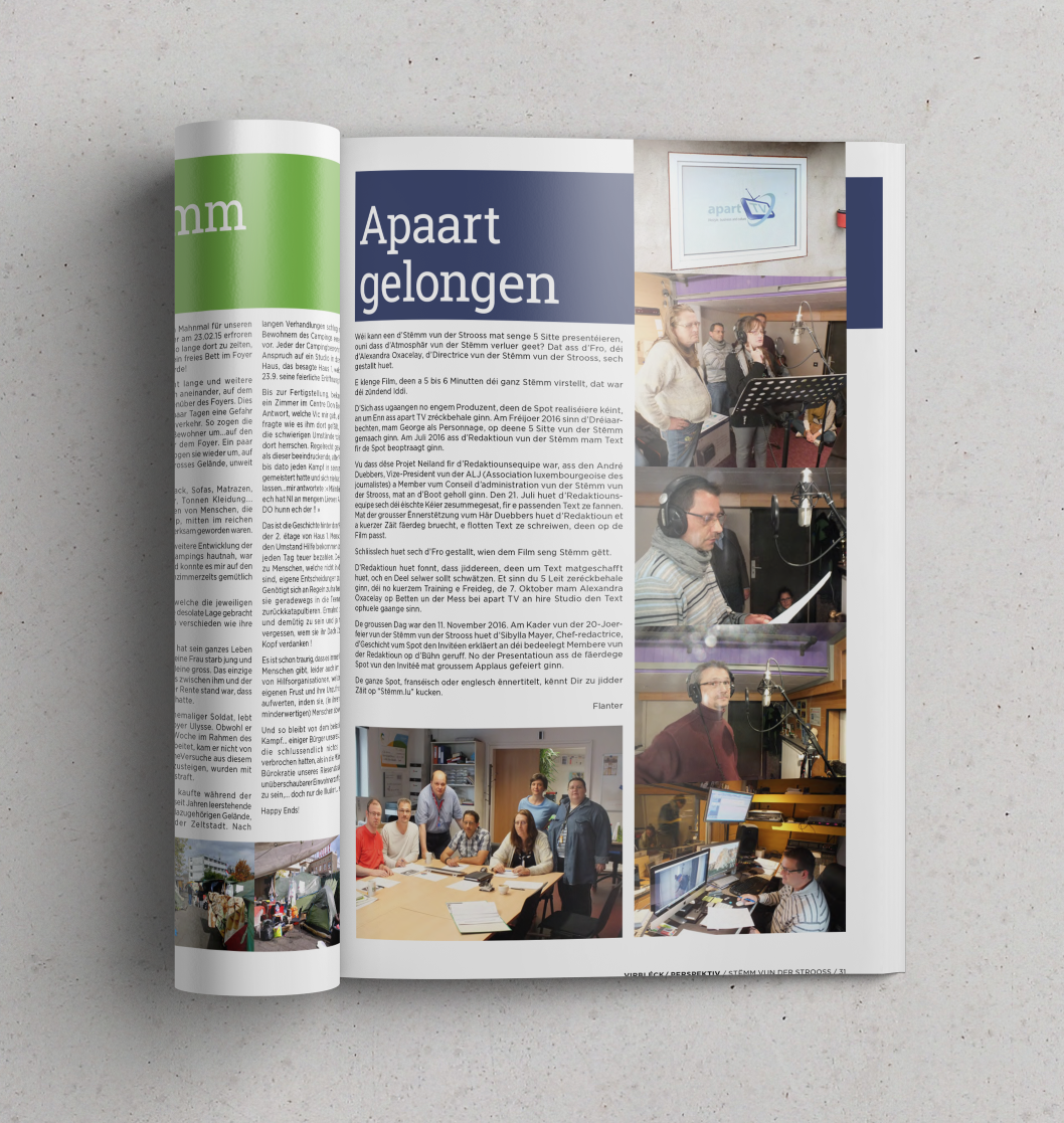
As the journal is published by a non-profit Luxembourgian organization, we added some photos taken at charity events and corporate meetings to flourish a community spirit.
Gripping layout design
One of our best print projects – a bimonthly journal redo. New design aligns its visual concept with actual content.
Read more about this case in our blog post "How graphic design led to surge in readership"