Do you feel like your offer should be getting more sign-ups and entries? Think about changing the way you are presenting it. In this case study, we show you how an international roaming ‘low-coster’ increased the number of online purchases by engaging with customers in their language.
Meet TEZ Telecom
TEZ is a transborder mobile operator that provides voice calls, SMS and Internet roaming. Services are delivered through a standard SIM-card. It works on a callback principle, which makes connectign up to 9 times cheaper.
Telecom Holding started operations in 2006. It currently includes offices in Estonia, Latvia, Ukraine, Russia, Belarus and the UK. Their mobile communication covers more than 200 countries.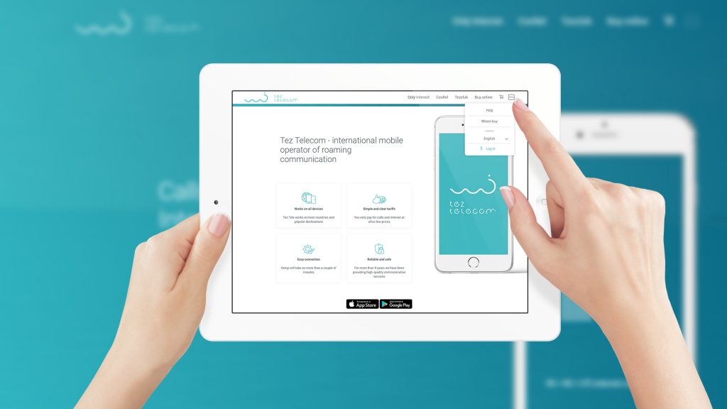
The Problem
In order to break into a competitive market, TEZ had to follow in Apple’s footsteps and try to ‘make prospects fall in love with their brand’. How? Through a smart, stunning, simple website that would represent the concept of comfortable travelling. As TEZ targets the UK, European and Asia markets, their site needs to support at least ten languages.
Although it doesn’t sound like a backbreaking task, does it? And yet, none of the developers who tried to carry out the project had been able to handle multilinguality.
Therefore, the brand decided to use a trusted team. The Loupe had just finished working at TezGSM app, when we got another offer from TEZ. The challenge was accepted!
What Was Done: UI/UX design and usability
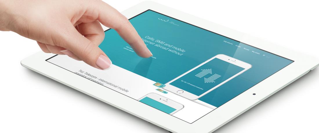
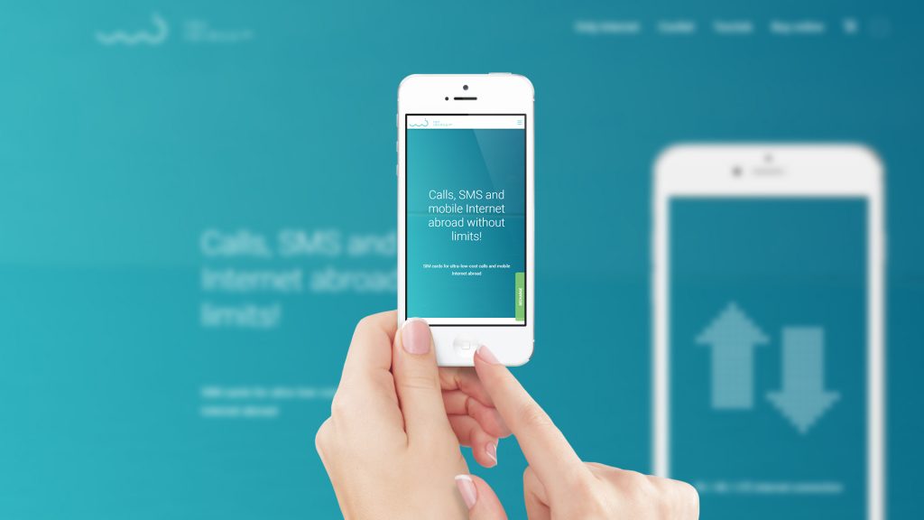
We started with research on the competition. Our team at The Loupe reviewed the websites of top European and Asian operators and developed a creative concept designed to help TEZ stand out from the crowd. The design work focused imbuing a sense of ease rather than just utility.
For that reason, we chose a warm sea-like design instead of cold hi-tech graphics. The homepage features a boat trip video in the background, which establishes a tone of adventurousness from the very beginning. The blue-and-white color scheme adds an eye-pleasing air.
Much attention was paid to usability. We stepped into client’s shoes to make sure buying, adding or recharging a travel card is only a few clicks away, as well as to contact the support team if the need arises. Customers can select a country, go to the app or make a purchase intuitively, without wandering in a maze of menus and options.
The website is mobile-friendly, which also contributes to a better user experience.
Bonus
In the process of developing the website, we arrived at an empowering idea. Why not underline brand identity via card redesign? Since our intention met TEZ’s needs, the idea had been approved.
The Loupe carefully selected a specific color for each card type. Basic combinations (e.g. red & green, blue & grey) were excluded as trite and less recognizable by colorblind people. The choice fell on plum, turquoise and tangerine, which are bright, catchy and high-contrast.
The new design has a zest about it – with a wavy background repeating the lines of the corporate logo. Not only does it look trendy, but it also catches the eye. A win-win solution!
Results
The website has doubled TEZ’s target audience. It encourages visitors to do linger, sign-up and become regulars. According to TEZ, they are now selling more products of all types, including their own debit cards. As for our ‘printed’ renovation, it has led to fewer usage issues.
Are you determined to expand your business? Let web-design help. The Loupe is right here, looking forward to creating solutions for your design challenges.
Read more about our UX design services.