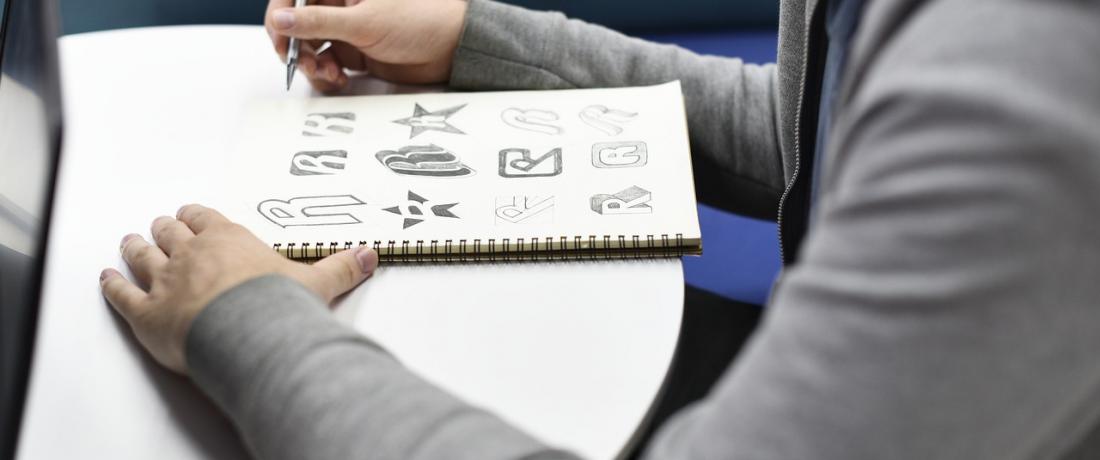
In business, they talk about branding all the time. You ought to have a style to differ from others, and that style is mainly represented by a logo. It is a showcase demonstrated to the prospective customers, a face turned to them. Therefore, picking a logo is a vital but risky procedure: one mistake may cost you everything – money, trust, and reputation. Of course, there is always the “outsource” option: hire professionals and delegate the task. But how would you know their choice is right? Just look at the plethora of horrific logos in the web – someone has paid for these. With our tips, you will be wiser. Here are three signs of an unregrettable logo.
Catchy
The main purpose of any logo is to drag your brand out of the blind area. Nowadays people are lost among tons of bright adverts, which gradually merge into a giant blur. We pay attention only to exquisite pieces that are easy to remember. Hence, a logo has to catch an eye in less than a second, but stay in mind for much longer. No acid colors or candy cane fonts – they are more tiresome than memorable. To stand out from the crowd, follow the KISS Principle – “Keep It Simple, Stupid”. Most of the successful brands choose recognizable forms and items (letters, geometric figures, animal shapes, etc.) that DO NOT illustrate their products. Apple doesn’t use phones, Nike doesn’t use shoes, Mercedes doesn’t use cars. Follow their example – think outside the box. Or be the millionth coffee shop with a coffee bean logo.
Appropriate
A logo is not a thing-in-itself. It speaks for your business, showing what you do and expect. Not directly but conceptually. And while a bad logo addresses the company, a good one reaches the target audience. What does this mean? You may be fond of graffiti, anime or Chiller, but neither of these will fit a law firm, because its potential clients think in another language. So make sure a logo is suitable for your working sphere and price segment. Otherwise, it will be a waste of time. Speaking of which, mind that appropriateness is fluent. A design feature that seems etsy today might turn incongruous and old-fashioned in a couple of years. So leave trends to runways – choose classics instead of modish arrows and globes. Be timeless. Like Coca-Cola.
Reproducible
A good logo is supposed to be versatile enough to stand strong on all media – from billboards and newspapers to TV and the Internet. So if it cannot compete a chameleon, keep searching for an image with higher adaptivity. Your logo should look well, regardless of size, both in color and black-and-white. Small extraneous details or thin lines are not an option – they will probably “disappear” when printing on different carriers. Always prefer Vector graphics to Raster formats (jpg, png, gif, etc.). Vector logos can be super enlarged or reduced to the size of a post stamp without jeopardizing quality. This allows weighing all pros and cons before making the final choice. See? It is easier than you thought. Follow the checklist and tell the good from bad. The criteria are clear enough to get a dream logo with minimal effort. Good luck! Contact us to get more information!